Glassdoor
Redesign of Glassdoor’s job details page to make information more intuitive and accessible for users.
UX Researcher
Stephanie Maltese (Umich UXR)
Iris Wang (Umich UXR)
Lan Wang (Umich UXR)
Ruijie Zhao (Umich UXR)
Stephanie Pompelio (Glassdoor Sr Product Design Manager)
Lauren Lindeen (Glassdoor Sr Lead User Researcher)
NDA
To respect Glassdoor’s confidentiality and adhere to the NDA, I am limited in the display and discussion of this work publicly and can only write about non-proprietary project and product details.
The Problem
Hey! Let’s Imagine You’re Searching for a Job

You’ve filtered through dozens of listings, and finally, you land on one that looks promising.
You clicked in.
Now, you’re reading through the job details—company overview, salary, benefits, responsibilities, ratings. There’s a lot of information. Some of it is helpful, but some sections feel repetitive.
At some point, you pause.

Are you getting the details you actually care about?
Or is all this information just making your decision harder?
This is Exactly What Glassdoor Wanted to Find Out!

To answer these questions, we set out to understand how job seekers interact with job listings, what details they prioritize, and how we could make the experience more intuitive and useful.
The Process
We Conducted a Full-Cycle UX Research Study
We conducted both quantitative and qualitative research method to understand what details users prioritize, how they navigate job postings, and where the experience could be improved.
*Note: due to NDA restrictions, I will only share an overview of our process and timeline without disclosing specific data.
Interaction Mapping
Explored Glassdoor’s job details page to understand flow & structure.
User Interviews
Conducted sessions with job seekers to understand their decision-making process, identify content priorities, and uncover challenges in navigating job details on Glassdoor.

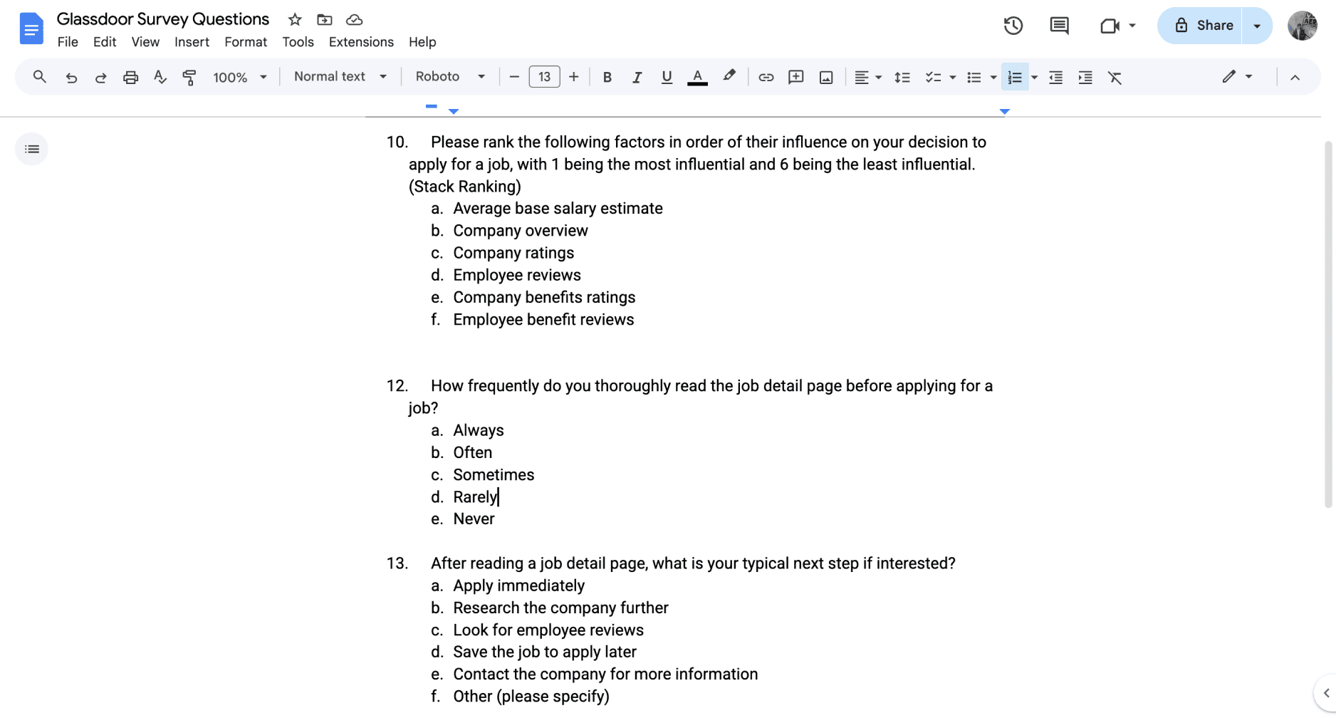
Survey Design & Deployment
Launched surveys to quantify job seekers’ preferences
Heuristic Evaluation
Assessed content hierarchy, readability, and navigation, we conducted a heuristic evaluation of the job detail page

Usability Testing
Tested the job search and job details page to uncover usability issues and friction points in the application process and user flow

The Transformation
See the Impact!
As part of our broader efforts to make Glassdoor’s job search experience more intuitive, two key improvements were implemented and went live.

Before
🔴
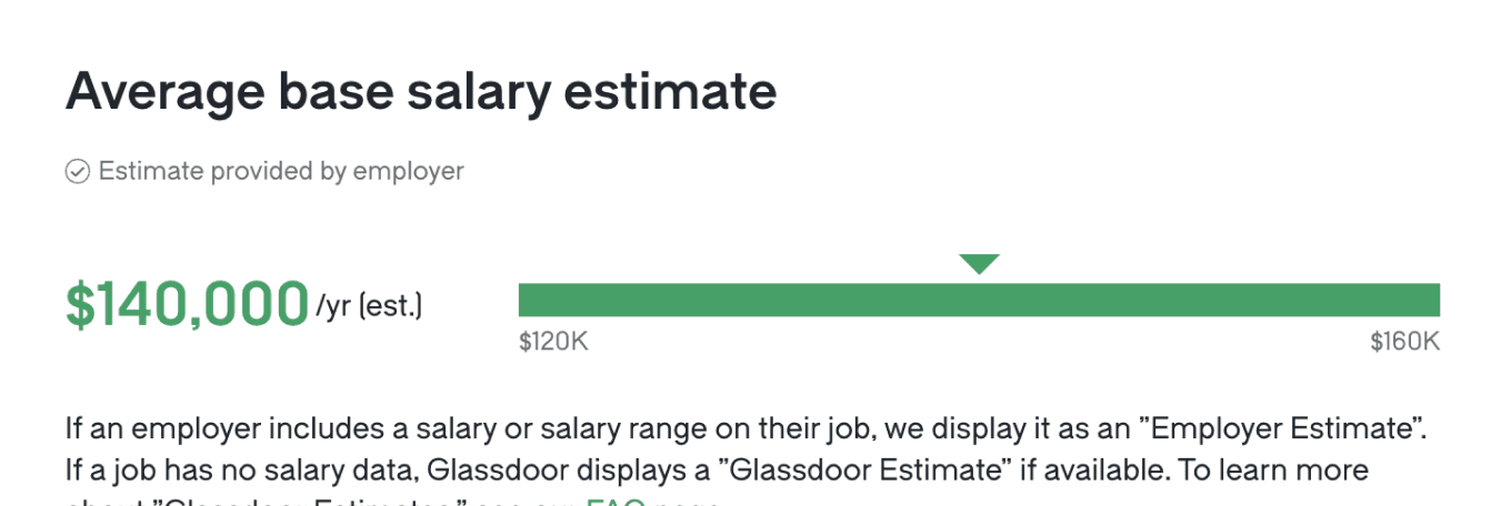
Salary information was there, but not immediately obvious
🔴
Users often misread a single salary figure, not realizing whether it was a fixed amount or an estimate
After
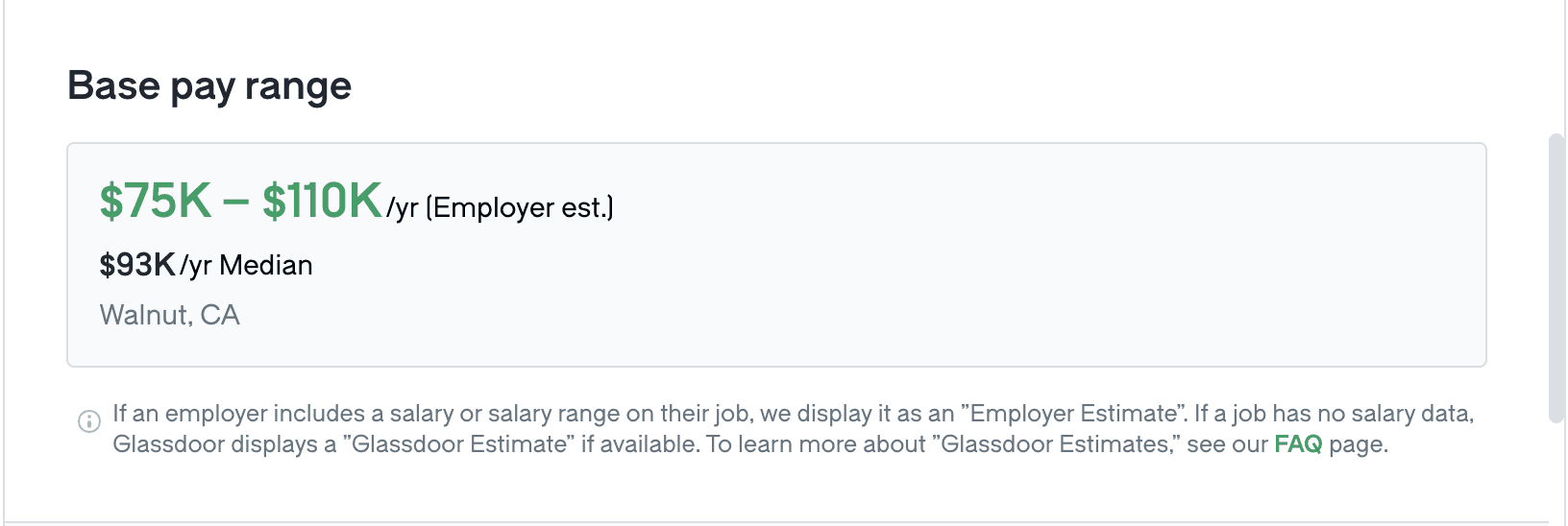
🟢
Bold salary range ($75K – $110K) and clearly labeled median salary ($93K/yr) improve transparency and quick decision-making
🟢
Cleaner design reduces visual clutter, making salary information easier to scan and understand at a glance
02 Giving Job Seekers More Screen Space

Before
🔴
The Save, …, and Apply buttons were permanently fixed at the top, always taking up space
After

🟢
The buttons start at the top, but once users scroll past the first screen, they shift to the bottom, staying within reach without taking up space
Wrap-up
My Key Takeaways are...
Small design tweaks can have a big impact – A simple shift in button placement and salary formatting reduced friction and made job details more intuitive.
Always ask why - Whether it's why users behave a certain way, why a design works (or doesn’t), or why certain details matter, questioning assumptions is what leads to meaningful, user-centered improvements.
Discover More